Creating a Golden Thread throughout your Home
The golden thread theory (or red thread to others) is probably the most overlooked yet impactful interior design guidelines out there. It’s the magic ingredient used to create a cohesive and flowing interior experience that spans all of the rooms in the home. Clever use of shared colours, materials and textures create a common connection amongst the rooms, binding them together as a whole rather than as separate spaces. This creates a sophisticated and well-considered look that many of us lust after.
If you take a look back at some of your favourite interior accounts on Instagram, you are bound to recognise several golden threads that run throughout them. To explain the theory further, I’ve used some of my favourite accounts that are each a great example of how a certain golden thread has been integrated throughout the home in a successful and considered way. There are five key principles to follow, so let’s get stuck in!

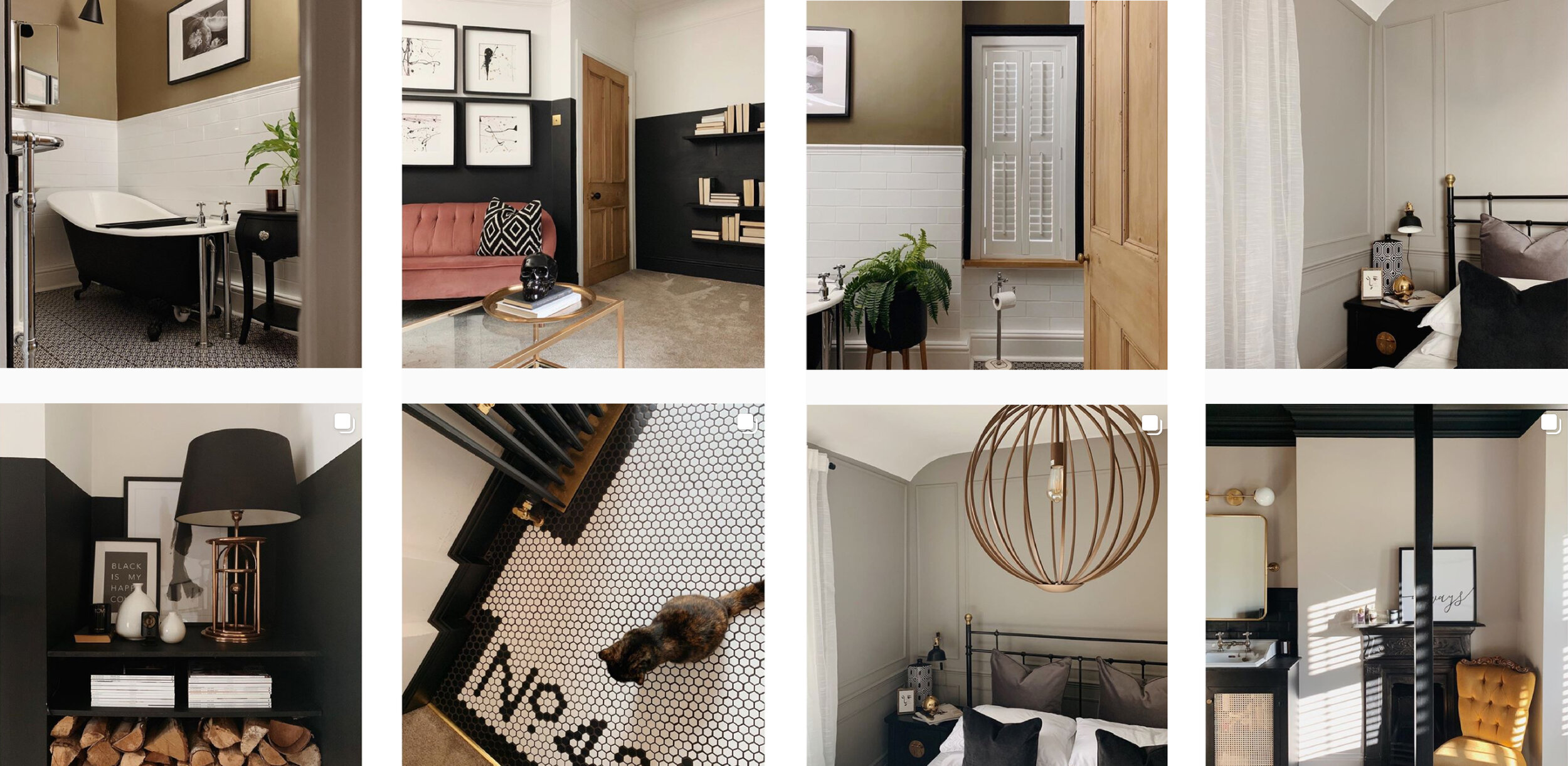
Jo’s home uses a neutral monochrome palette that focuses and shades of green and beige. Click here to see more.
Stick a similar colour palette
Use colours throughout your home that complement each other rather than clash. Choose ones that look good together to create a colour harmony by using a few rules of colour combinations. Using a colour wheel, the general rules are:
Complementary - two colours that are on opposite sides of the colour wheel
Monochromatic - Three shades, tones and tints of one base colour.
Analogous - Three colours that are side by side on the colour wheel.
Triadic - Three colours that are evenly spaced on the colour wheel.
Tetradic - Four colours that are evenly spaced on the colour wheel.
Jo’s home (@theintrovertshome) is a fantastic example of a monochromatic colour palette which uses a neutral base with shades of grey-green to connect the rooms. As she perfectly demonstrates, don’t just apply this notion to the walls of your home, use the theory when considering what furniture or styling items to include too. Not only will this create a cohesive look but it also means you can easily move furniture around when you fancy a little change.
Chelsea’s home features hints of gold and pink to pull the spaces seamlessly together. Click here to see more.
Pick an accent colour
Accent colours are used for emphasis in the overall scheme. The colour chosen is often bold, vivid or strong but is used sparingly to create a visual connection between each room. If you are scared of too much colour (like I am a little!) it’s the perfect way of adding a splash into the mix, for example through a vase or cushion cover but without overdoing it. It’s said that 60% of a room should be the dominant colour, 30% a secondary colour and the remaining 10% an accent.
A great example of this is in Chelsea’s home (@thehousethatblackbuilt). Monochrome is the dominant colour scheme, followed by the natural colour of elements such as rattan and timber, then pink and gold are used as subtle accent colours to connect the spaces.

Lucy uses elements of minimalist and scandinavian styles to make her interior spaces flow effortlessly. Click here to see more.
Celebrate a particular style
While trends come and go it’s important to find a design style that you are happy with that will stand the test of time. Nowadays its fun to break the rules and mix and match depending on what you like, which is fine as long as this interior style is communicated throughout all of the rooms in your home. It’s possibly the clearest and most visually apparent golden thread possible, and thankfully due to most people having a preference about what design style they like, this will naturally come across throughout each room.
One of the best examples of carrying a unique and personal design style throughout a home is from Lucy (@mykindlifestyle), who has let a natural, minimal and scandi style influence each decision she has made about her interiors, from the wall finishes to the objects she styles with.

Emma’s home celebrates a considered and contextually relevant material palette. Click here to see more.
Work with a set material palette
Establish a material palette that features throughout each of the rooms and manifests in different objects. For example, in the kitchen you may have a marble worktop and brass taps so could continue this palette throughout the other rooms of your home with marble and brass accessories that visually portray a connection. By carefully curating the materials chosen it will avoid a disjointed feeling and you will achieve overall a more harmonious effect.
A great example of this notion is in Emma’s home (@_thelakehouse_) where the same material palette is used both inside and out to create a seamless and flowing experience. White finishes combined with natural materials such as timber and stone run fluidly throughout the home and have been purposefully used in different quantities, with the result visually tying all of the rooms together whilst still managing to create a unique atmosphere in each space.

Louise’s home demonstrates the clever use of pattern and texture to create a flowing experience. Click here to see more.
Use similar textures and patterns throughout
Textures and patterns are so visually enticing and tactile that they can be a fantastic way of connecting a series of rooms. Although they are often only manifest in small gestures such as cushions or framed prints, the impact they can have on any space is incredibly profound, so you can imagine the result if similar textures and patterns are incorporated throughout the whole house. However don’t go crazy, choose only two to three textures or patterns and for best results make sure they contrast with the existing colour palette of the rooms.
Louise’s (@dougs.digs) home and style is a wonderful example of using textures and patterns to create an overall cohesive look. She uses scandi inspired geometric patterns combined with 3D textured cushions to tie the spaces together, whilst ensuring that the colours and materials of these elements are always tonal or complementary.
What’s my golden thread?
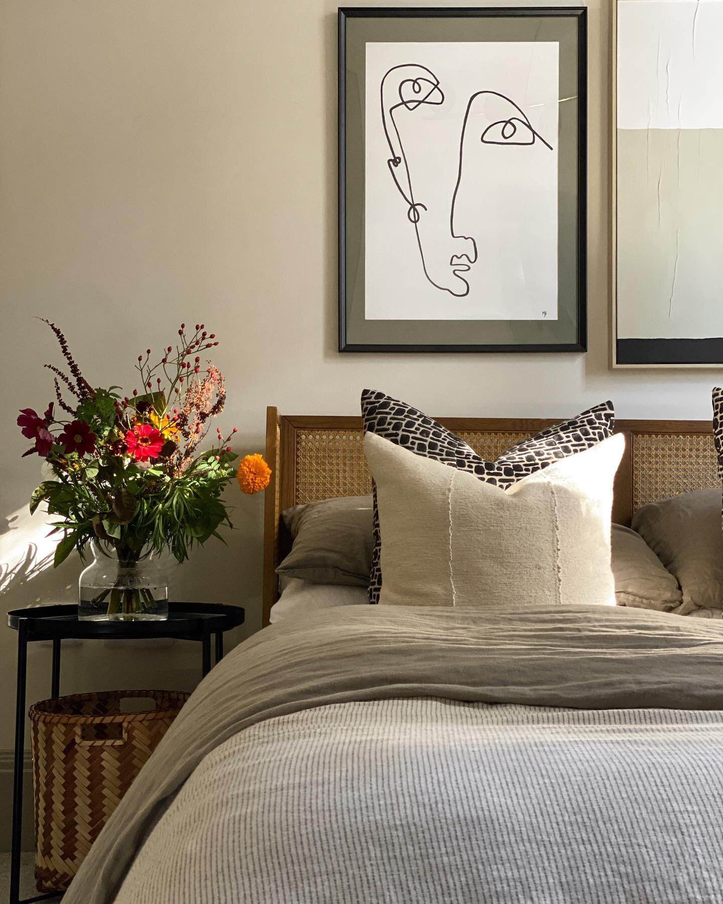
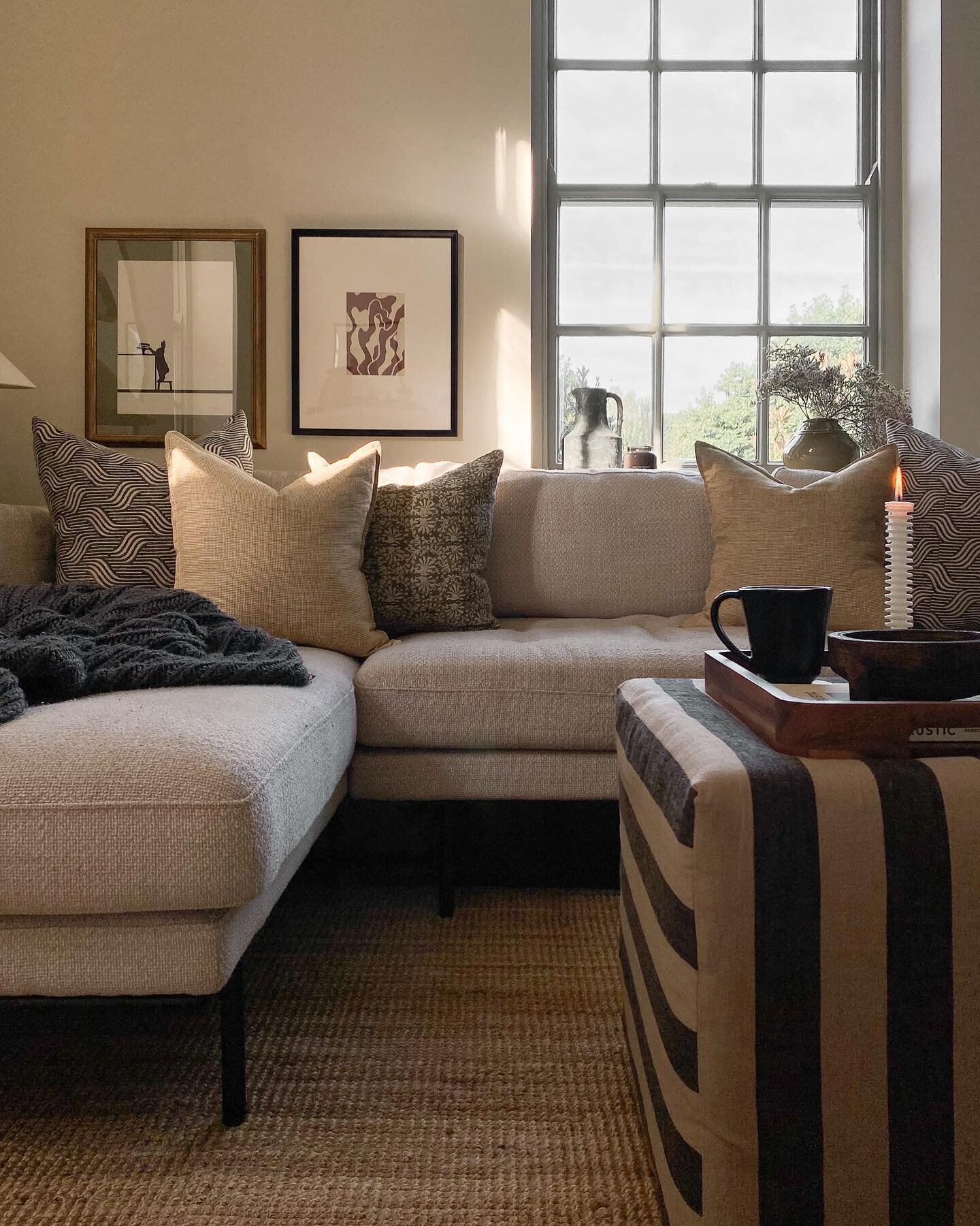
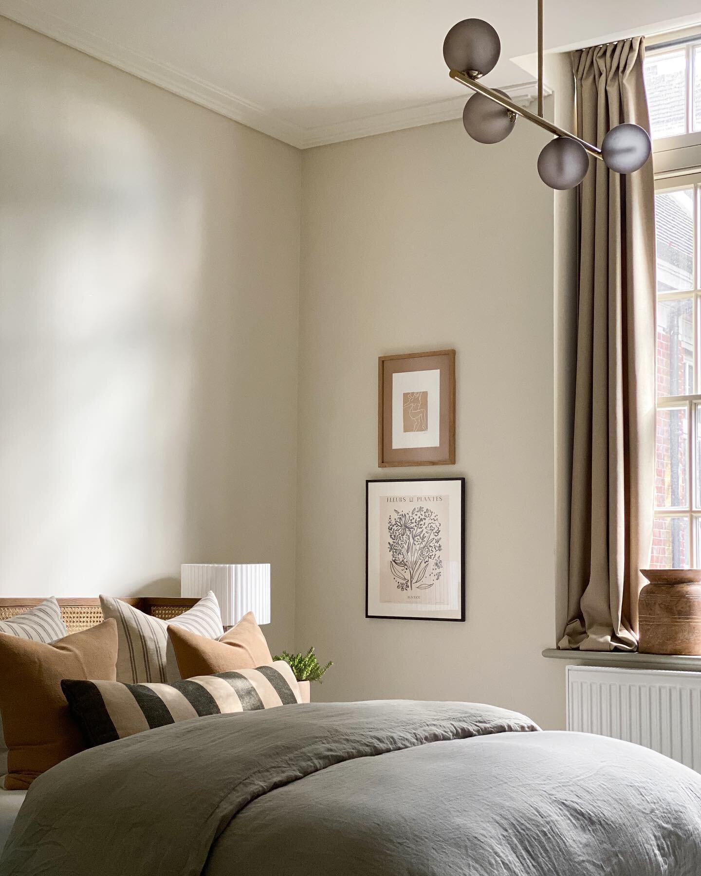
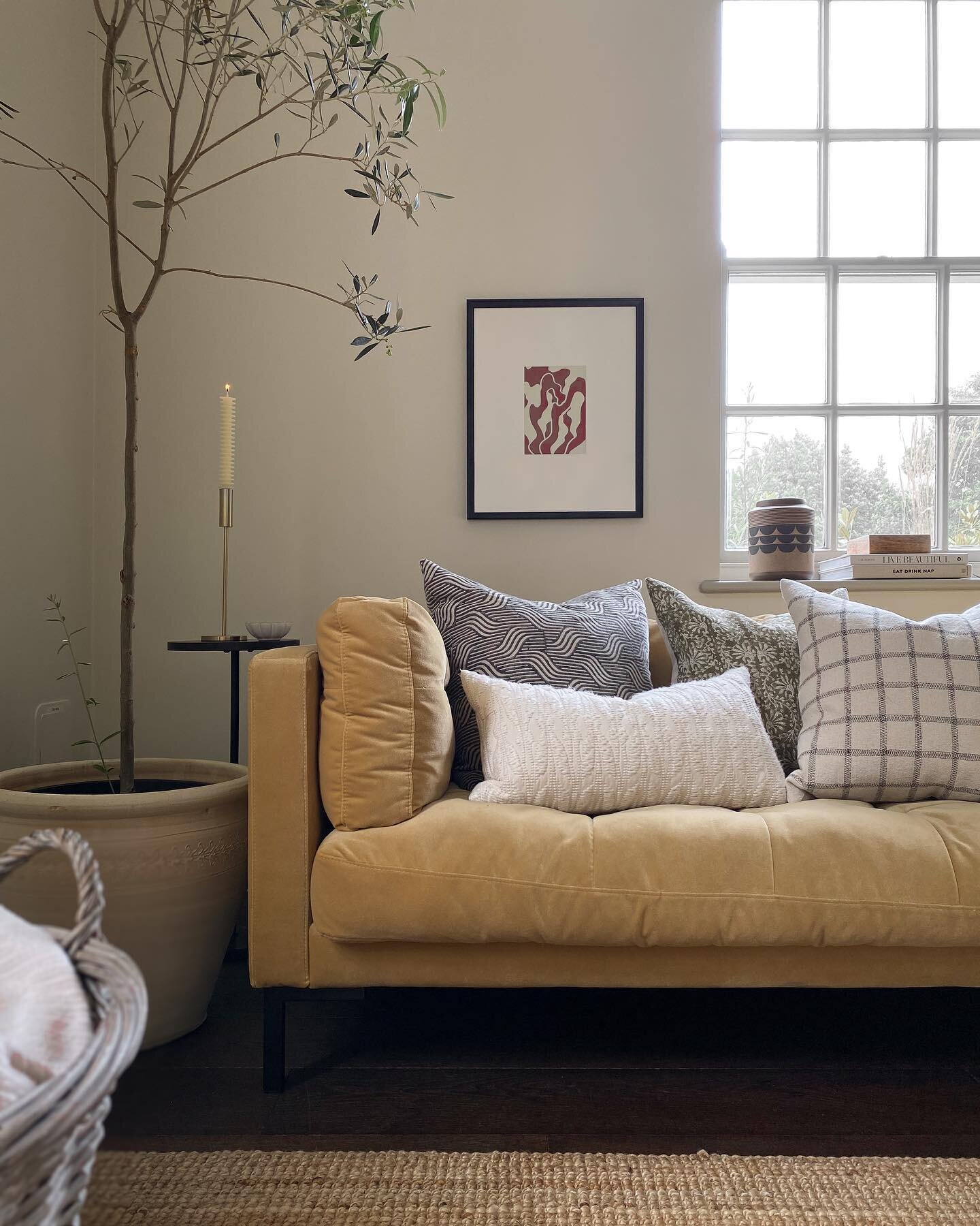
At the moment, my golden thread consists of using dark green and amber, never on a wall but either on furniture or an accessory. As for materials, I like to ensure a hint of brass, black is featured within each room, whether that be in a candlestick, in the handles of a drawer or a picture frame. Finally, and perhaps a more unconscious thread is the use of velvet, beginning with our living room sofa and weaving its way throughout all the rooms in the form of cushions - I have a feeling this will soon shift to linen! Greenery is also prevalent in each space, you can always rely on plants to connect a series of rooms together too, which is another way I’ve visually connected my living space and terrace together!
I think it takes a while for you to realise what your golden thread is or should be, but whether you are just starting to design the interiors of your home or are simply musing on Pinterest, the underlining point is still the same, where possible never decorate a room in isolation and instead always consider your home as a whole for the best possible outcome. So get planning, creating simultaneous mood boards and let me know what your golden threads are!